
Simplifying donation process to help underprivileged communities.
reBoot is a nonprofit organization that provides electronics to underprivileged communities across Canada. However, the electronics donation process seemed inefficient and overwhelming to the users, causing them to abandon it. I facilitated testing sessions with users, re-defining information architecture, experience mapping, and re-designing the UI.
🗒️ Overview
To identify issues with the current donation process, I asked 10 users to try to make a donation using reBoot’s existing platform. This clarified the challenges they face.
🧪 User Testing
📊 Testing Results
8 out of 10 users were not able to complete the donation process becasue of the following issues.
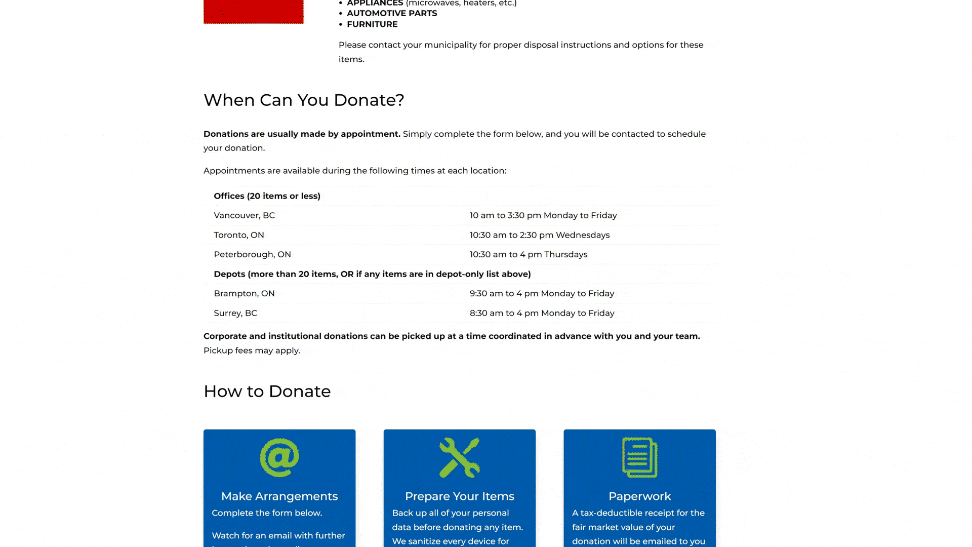
Current Donation page
Issues faced by users
Confusing Donation Page: The donation page has multiple forms, but their purposes are unclear.
Inconsistent Forms: The different looks of the donation forms make the website seem untrustworthy.
🤏 Defining the problem
I was able to find 2 major issues holding donors back from donating electronics.

Information Overload
Donors did not know where to look as they landed on the donation page and found the information scattered throughout the page leading to an unpleasant experience.

Inconvenient Donation Process
Donors were unsure if the organisation accepted the item they were trying to donate & found the donation form confusing leading to abandoning the donation process.
🧔 Persona
Consolidating the testing, I created a persona that represents the target audience : Alex

📍 Alex’s Journey
We created a narrative journey that centers around a user who wants to donate his old laptop using reBoot. The goal was to understand the user better and find opportunities for design.

☝️ Our Solution

To reduce information overload
We streamlined the homepage to create an environment where donors can effortlessly absorb key information upon arrival.

To make donation process convenient
We restructured the donation form into clear, sequential steps, ensuring a seamless process without overwhelming donors.
📏 Sketches and Wireframes
We did rounds of sketching to explore functional layouts. These layouts then were turned into low - fi wireframes and then into Hi-fi working prototype.

🤘 Introducing
updated reBoot
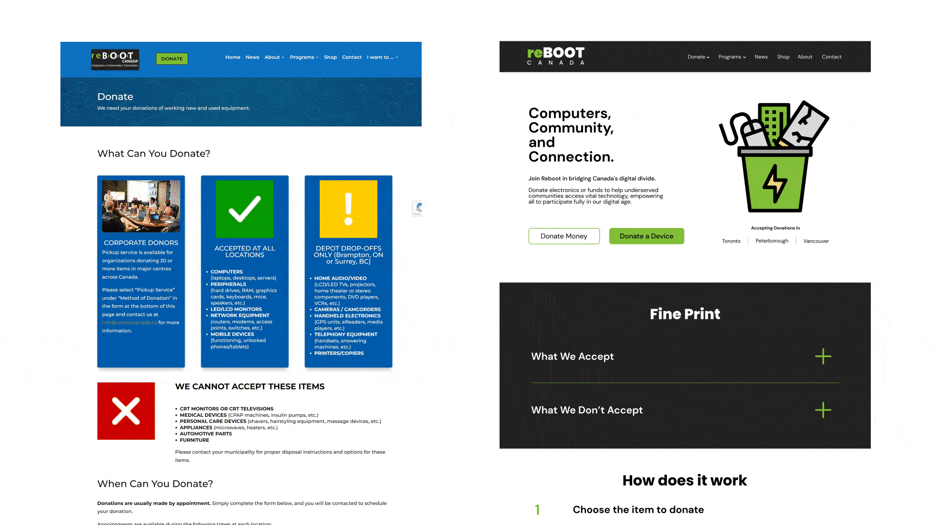
Donation Page - A carefully crafted webpage that minimizes information overload & directs the eye to the crucial information.

Reducing information overload by re-organizing the information.

Donating a Device - Simple form broken into 6 steps with clear instructions.

Donors can now input their electronic device's name and quickly check if it's accepted for donation by reBoot.
Simplified, clear header.
Two most important donation CTAs at the top leading to 2 unique flows.
Supporting text reflecting reBoot’s purpose and values.

Clear instructions on how to donate.
Donors are now able to see where their donated items are sent to help the community.
Visual representation of donation form steps for donor guidance.
Two distinct donation options: Individual or Business

Old
New
🧪 Testing the update
We tested the updated reBoot website again with 5 new users and asked them to use the updated website to attempt donating an electronic to see if our solution is working as intended. The results were positive.
Users found the layout both appealing and easy to navigate
They were effortlessly able to complete the donation process.
💭 Final Thoughts
This was our attempt to help reboot and make a positive impact. Through this project, I learned how important is it to give users the info they need simply and also to break down complex info into multiple steps to avoid information overload. Although, this might not be the ideal solution for simplifying information every time, in reBoot’s case the users highly benefitted from it making it a successful solution.
