Keeper
Helping pet parents travel freely without worrying about their pets.
My Role: Product Design, UX Research, Usability Testing, Ui Design & Prototype
Timeline: 10 Weeks
Tools: Figma
About this project
Keeper is the result of my 10-week-long project, It's a platform crafted to help pet owners during their travels while ensuring the safety and security of both their pets and homes. As a solo project, I led the entire product development. Many existing pet-sitting apps raise safety concerns, with distressing accounts of mishandling and theft. By analyzing the research and using design thinking I attempted to address this critical issue by prioritizing pet safety and reliable care, offering professionally trained and trustworthy pet sitters empowering owners to travel without concern for their beloved companions.
How might I help pet owners feel confident leaving their pets and their houses with trustworthy and reliable sitters when they're away?
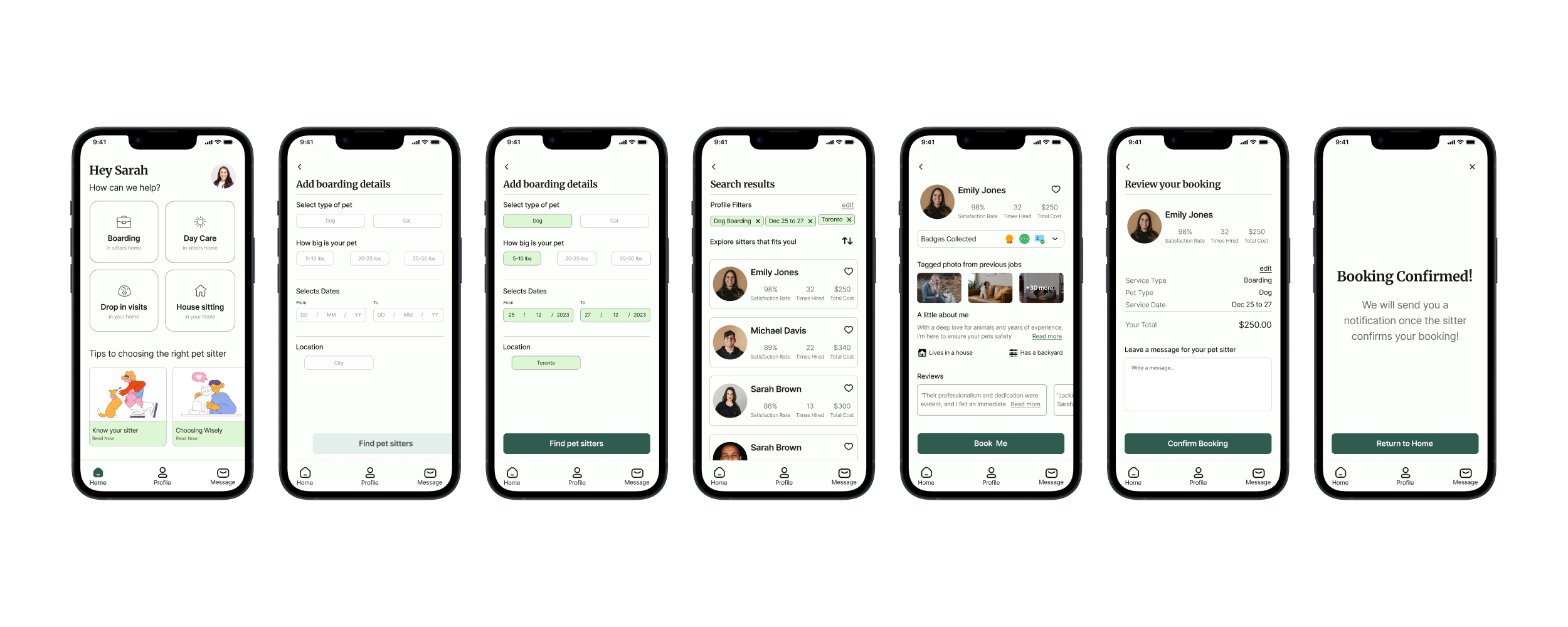
Introducing Keeper
Solution
Helping pet owners find the perfect, safe, and reliable pet sitter.
My Process
User Interviews
To understand why pet owners’ situations better prepared a set of questions and interviewed 5 participants. All interviewees were pet owners based in Canada.
Top 3 interview questions
How do you currently manage to leave your pet when you travel?
Have you ever canceled your traveling plans or missed an event because of your pet? Why did you have to change your plans?
What major concerns do you have when you have to leave your pet behind while traveling?
Interview Insights
From the insights I was able to sort the pain points into 3 major themes
Pet’s well-being is a priority for pet owners when they are away from them.
Limited pet-friendly travel options frequently result in cancellations or changes to desired plans.
Trust and reliability concerns significantly influence pet owners' travel choices leading to cancellations.
Competitive Analysis
A well-known direct competitor of Keeper was analyzed to determine the positioning of the app. User reviews uncovered room for improvement and major areas for growth.
Competitive Analysis Takeaways
Despite background checks, the platform has suspicious pet sitters available to hire.
The platform is accused of removing negative reviews from pet sitters’ profiles which is a big credibility and trust issue.
Sitter negligence led to pet harm, property damage, and theft.
The Interview and Competitive Analysis showed pet owners struggle with trusting their pet sitters. I focused on tackling this trust and reliability issue.
Persona
To represent the target audience I created Sarah. Sarah’s experience is similar to other pet owners where she’s struggling to find trustworthy and reliable pet care.
Sketches
After defining the task flow, I started sketching several screens that would help Sarah hire a pet sitter. I did multiple iterations and selected the one that presented information clearly and aided Sarah in completing her task. Below are the chosen screens for further development.
Initial Wireframes
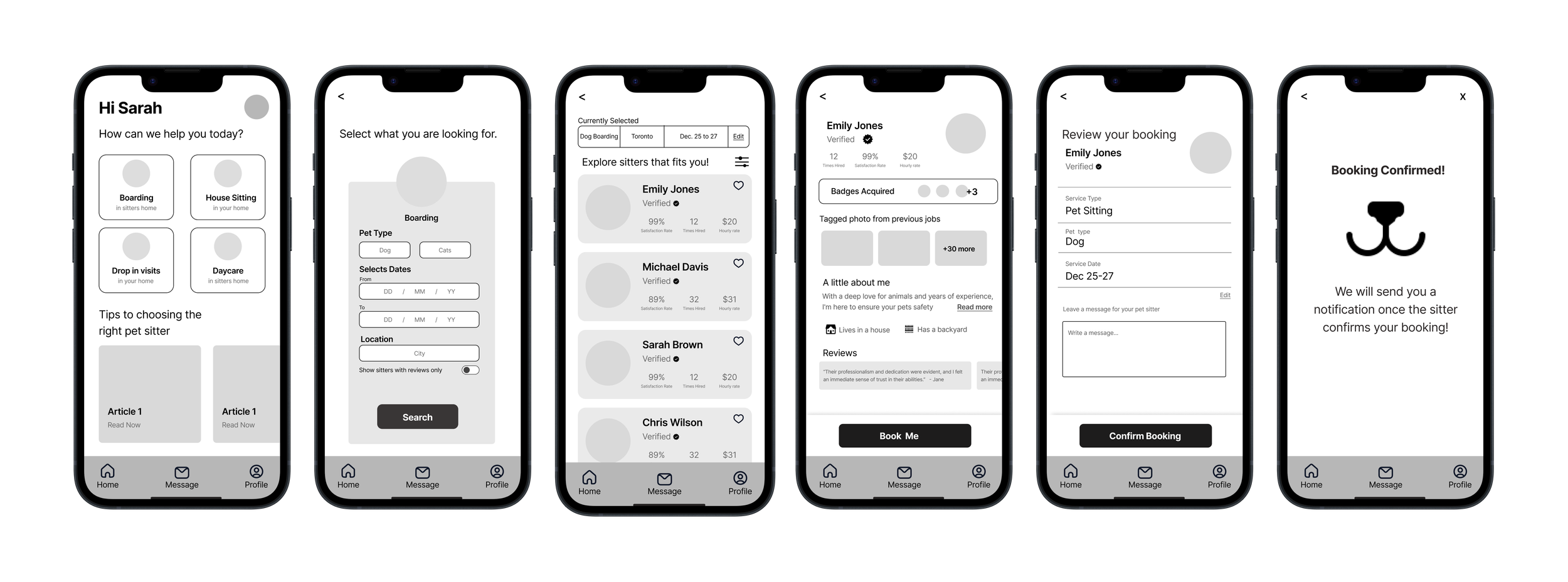
To develop the screens further, I digitized them using Figma. The goal here was to make a working prototype so that it could be tested with people. I modified my sketches in order to ensure a cohesive user experience.
Testing Wireframes
I created a lo-fi prototype and had testers go through the task of booking a pet sitter. This revealed what worked and uncovered elements I missed in my initial design.
Given that I was on a deadline, I made a prioritization matrix to find low-effort but high-value things I could fix in the app. Apart from design changes, here are some of the key things updated in the app
UI Design
Some words that describe the mood and emotion of the app are trustworthy, reliable, stress-free, friendly and safe. As a designer, I can take these words and translate it into colors, icons, fonts and other visual elements of the app.
Adding Color, Naming the app and developing icons
To ensure a welcoming, trustworthy experience for users like Sarah, I collected images reflecting Keeper's essence. I extracted the colors that stood out from the reference and chose the color #305C4F as it had the essence of trust and reliability. Using a spider diagram I came up with the name Keeper and developed a logo and icons for the app.
Accessibility
To ensure my product is accessible to everyone, I used Web Content Accessibility Guidelines (WCAG) guidelines by testing text color contrast on colored backgrounds, meeting AAA standards for broader audience accessibility, regardless of the visual abilities of users.
Design System
A design library was made that holds all the design elements of Keeper. This includes fonts, grids, colors and more arranged into atomic, molecule and organism design elements. This library serves as a guide for any designer who needs to design any new element for the Keeper.
Marketing
With a product to market, I created a marketing website for Keeper for desktop as well as mobile. The idea was to stick with brand colors to create brand awareness and recognition, as well as to bring more storytelling elements to this marketing website.
Final Thoughts
This was Keeper, it was a challenging project but I learned value of research and how it directly impacts the product. If I had more time I would have done more testing to identify any gaps in the product.
Nacho - Inspiration for Keeper
With that, the case study ends. Thanks for taking the time to go through it.Connect with me on LinkedIn or email at ranakrishna26@gmail.com


