
🗒️ Overview
Ani is a platform available on Android and iOS connecting anime fans worldwide, to discuss their favorite shows, be creative, and build a community.
Over time I helped shape multiple features and expand their design system. In this case study, I show how I deployed the forum feature while collaborating with a designer and a developer.
🗒️ Problem Overview
When I joined Ani, it had limited features that allowed users to rate their favorite anime, and message other users. However, there was no ongoing engagement between the users as a community.
How do we further develop the platform to foster user engagement, and build a sense of community?
📝 Problem Statement
🔍 Research
My research started with looking at existing platforms to explore how they do this. Some options we shortlisted based on best-performing platforms were:
Live events
Groups or Forums
Customized/Personalized Avatar/ Stickers
From the beginning of the Covid-19 pandemic, there was an 81% uptick in online community engagement.
Source: Amity.co
📝 Secondary Research
I choose forums because multiple studies show especially after the pandemic that it significantly helps increase user engagement and build a sense of community. This was also cost-effective for businesses.
💭 Defining
To understand how we can increase user engagement with forums we conducted user interviews with our existing user base. Here is what they said.
What motivates you or will motivate you to engage with the anime community?
🙋
I like to rewrite anime storylines and I'd love to share them with the community and hear their opinions.
🙋🏽
I’d like love to share my cosplays with the anime community as a creator on the platform.
🙋♂️
I want to connect with anime fans who love the same shows as I do, so we can chat, share updates, and exchange opinions.
☝️ Initial Proposal
We translated these ideas into following features
Fan Fiction
To write your own stories and read stories by other creators
Discussion
To start a discourse, share thoughts on shows, and characters.
✍ Visualizing proposed solution
Questionable reliability and accountability
Solutions: Stats, Badges and Photos
Times Hired: Shows how many times the sitter has been hired before.
Satisfaction Rate: Based on the rating the pet sitter gets from previous sittings.
Badges: Helps pet owners to see sitter’s credibility
Tagged Photos: Shows photos uploaded by pet owners from previous sitting jobs giving insight into how the pet was handled.
Ensuring the pets are looked after properly
Solution: Message box
Adding a message feature to write custom instructions for a pet’s schedule or other necessary things pet owners might wanna let sitters know about before making the booking.


🧾 Task Flow
Next, I made the task flow showing the steps the user would go through to book a pet sitter.

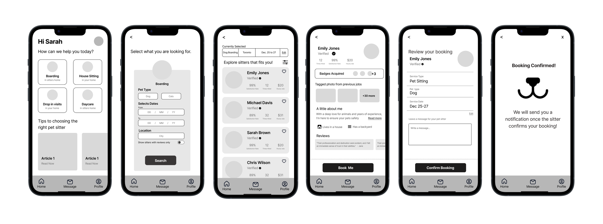
We sketched out the rest of the app screens showing how a user would go from the initial screen of the app to successfully booking a pet sitter of their choosing.
🖵 Rest of the screens
👨🔬 Validating the Solution
To see how users would interact with the screens we designed, I prototyped the flow and ran 2 rounds of usability tests, each with 5 users. Users were asked to complete the process of booking a pet sitter.
This highlighted some usability issues, things I had not considered, and things that could be improved for a better user experience.
Though users completed the task successfully they did experience some usability issues mentioned below. Additionally, I also made changes to the copy and design for clarity and better usability as some users were confused about it.
🧪 About Testing
1. Before: Users were confused about the “show verified sitters only” filter since the platform only allows verified and trained sitters to be on this platform.
After: “Show verified pet sitters” was removed as it did not prove to be necessary and created confusion among users.


2.Before: Applied filters bar confused the users.
After: Applied filters were split into cards.
3. Before: Users found the verified badge to be redundant.
After: Verified badge was removed as it did not prove to be necessary.
4. Before: Users wanted to see the total amount for booking rather than the “Hourly Rate”.
After: “Hourly Rate” was changed to “Total Cost” also helping them see which sitter fits their budget.
5. Before: Missing “Total cost” on the review booking page.
After: “Total Cost” added.

⚙️ Design System
Since this was a new product we put together from scratch, we made a design library that holds all the design elements of Keeper. The library serves as a guide for any designer who needs to design a new element for Keeper.
🤘Final Product
Keeper: Empowering pet owners find the perfect sitters and travel freely,
Jump to Solution


👀 Accessibility
To ensure my product is accessible to everyone, I used Web Content Accessibility Guidelines (WCAG) guidelines by testing text color contrast on colored backgrounds, meeting AA standards for broader audience accessibility, regardless of the visual abilities of users.

The final product was tested with pet owners and pet sitters and received positive feedback. Pet owners expressed interest in using a product like this. as a method to solve their issues around booking pet sitters eventually allowing them to travel with peace of mind.
📏 Measuring Impact
Initially, I believed existing market solutions were effective for this issue. However, through research and conversations with pet owners, I discovered their flaws and gained insight into why trust is lacking in these platforms which helped me design Keeper.
📋 Takeaways

Nacho - Inspiration behind Keeper